

Introduction
A logo is a graphic representation of the story you are trying to tell about your food business. It’s another opportunity to connect the dots for your consumer through your color, style, and font choice!
This guide walks through types of logos, best practices, and the psychology of color. Let’s get started!
Types of Logos
We are going to look at four different types of logos:
Font-Based/Wordmark
Service Product/ Iconic Illustration
Abstract Graphic Symbol
Combination Marks
Font-Based/Wordmark - Font-based logos use a typeface treatment on their business name. Font-based logos work best for companies with unique names, like Google, Fender, etc. as well as groups just starting off who need to distinguish themselves in a clear, memorable manner.
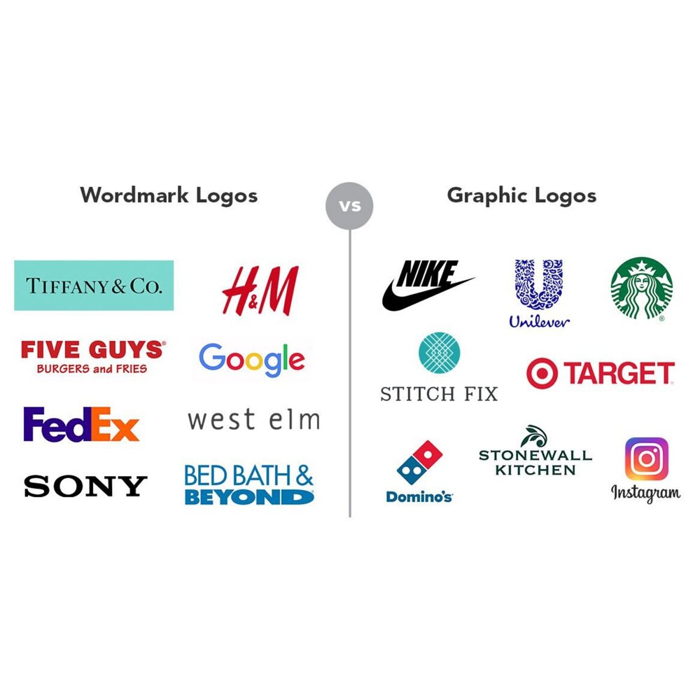

Service Product/Iconic Illustrations are visual representations of a company’s offerings or brand personality. They are designed for transnational and high-profile organizations who are “influential enough to be widely recognized by a symbol alone.”
Abstract graphic logos, a subcategory of service product/iconic illustrations, use imagery to complement a brand’s personality and differentiating characteristics. Again, the abstract graphic symbol best suits well-established, large brands with the bandwidth to build consumer-symbol association.
Combination Marks pair symbols with typeface logos. They are the most popular choice as well as the most effective one, spelling out a company’s name alongside its visual identity.
Best Practices for Designing a Logo
Be Unique & Appear Active - A strong logo design will help your brand stand out. Use twists, abstract shapes, and tapered lines to stimulate movement and increase the likelihood of consumer brand recall.
Balance Simple with Different - Balance intriguing patterns with simple lines to avoid over complicating pieces. Logos with too many details will translate poorly to smaller reproductions and risk looking muddy. Instead, concentrate on highlighting the core mission of your business. Always ask yourself if something is needed or not. Does the same message translate without the extra element? If so, remove it from the logo design.
Brand Personality - Make sure your logo matches your brand personality. Consistency is critical in building a loyal consumer following. Mixed messaging, on the other hand, undermines the general perception of an organization's credibility.
Composition - Be conscientious of the negative space in the layout. While consistent spacing between shapes and lettering will create symmetry and cleanliness in the composition, inconsistent spacing will make the design look amateurish and incomplete. Use negative space to focus viewers in on a specific object or word. Check out some great examples here.
Legibility - Be careful when using gradients on a logo. Tints that are too light will disappear when printed, whereas tints that are too dark will leak into solids.
Small Color Palette - Logos with a lot of different colors may be expensive to print and/or difficult to reproduce. Instead, incorporate shading to add dynamism and texture. Smaller color palettes will keep the logo looking sharp and clean.
Adding Colors - Add colors at the end of the design process. At the very least, the logo should work with a dark and light background. Play around with different variations and see what looks the best.
Choosing Colors - Select logo colors that match the brand personality based on the list of general color patterns below. However, do not worry too much about aligning the brand with stereotypical color emotion-associations. Individuals perceive colors differently according to their upbringing, personal experiences, socioeconomic status, etc. It is far more important that the brand colors are perceived as congruous with the brand personality than actually eliciting specific emotions from consumers.
Psychology of Colors in Logo
Colors emote different emotions for different people. Below, we’ve pulled together some of the most commonly associated emotions with various colors:
RED - Passion, energy, danger, warmth and heat; stimulates appetite*
Popular Red Brands: HSBC, Redbox, Target, Netflix, and Coca-Cola
ORANGE - Innovation, modern thinking, youth, fun, affordability, and approachability
Popular Orange Brands: Home Depot, Fanta, Nickelodeon, and Gatorade
YELLOW - Caution, sunny, warm, friendly; stimulates appetite*
Popular Yellow Brands: Best Buy, McDonald's, Sonic, Sprint and Denny’s
GREEN - Natural, ethical, growth, freshness; corporate social responsibility
Popular Green Brands: Starbucks, Whole Foods, Heineken, and Sierra Club
BLUE - Professionalism, sincerity, clam, dependable, secure, integrity; most popular color for corporate brands, online businesses, and financial institutions
Popular Blue Brands: Intel, Facebook, Skype, All State, Ford, and Twitter
PURPLE - Royalty, luxury, wisdom, dignity; associated with the church and power
Popular Purple Brands: Hallmark, Milka, Cadbury, Yahoo!, and FedEx
BLACK - Power, sophistication, elegance, formality, authority; Mostly used by high-end brands as main color or paired with another accent color
Popular Black Brands: Dior, Chanel, Burberry, Adidas, and Nike
BROWN - Masculine connotations, rural life, outdoors
Popular Brown Brands: UPS, M&Ms, Edy’s, and Cracker Barrel
PINK - Female connotations, flirty, fun, love, compassion, nurturing
Popular Pink Brands: Pink, Barbie, Pink Floyd and Cosmopolitan
Choosing Shapes
Shapes, as with colors, follow general patterns (listed below). Their impact is less distinctive than that of colors, but is still important to consider in your composition.
Curves - Positive, comforting, and reassuring; Imply movement
Vertical Straight Lines - Stability, strength, and balance; Popular in corporate logos
Horizontal - Tranquility, community, silence, and composure
Diagonal Straight Lines - Dynamism and rapidity
Circles - Interconnected, partnership, and endurance
Squares/Rectangles - Reliable and balanced
Triangles - Dynamism, caution, and danger
Comments